
Enterprise fleet management platform. One designer. A broken interface used by operators across three continents. Here’s what happened when we finally fixed it.
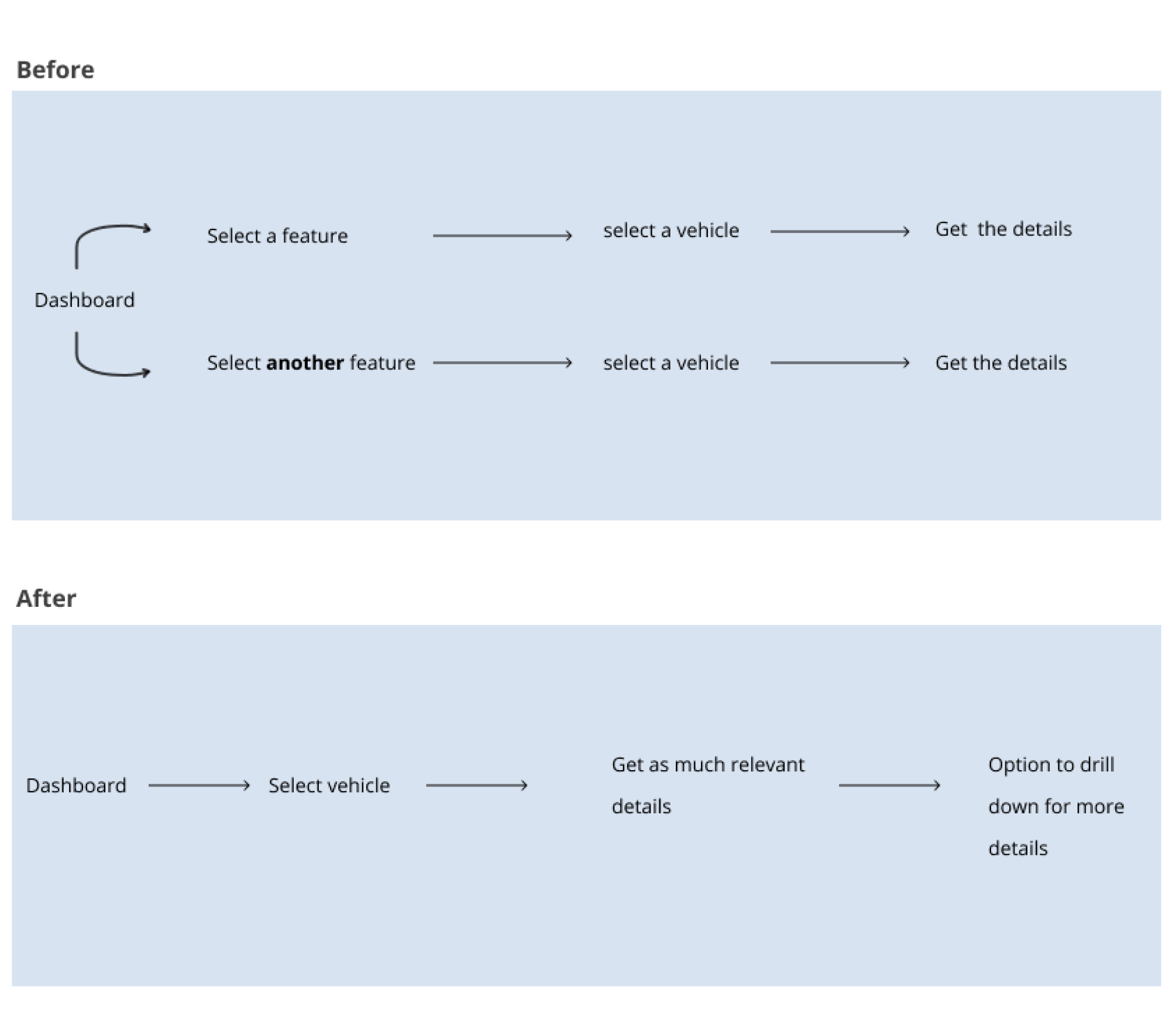
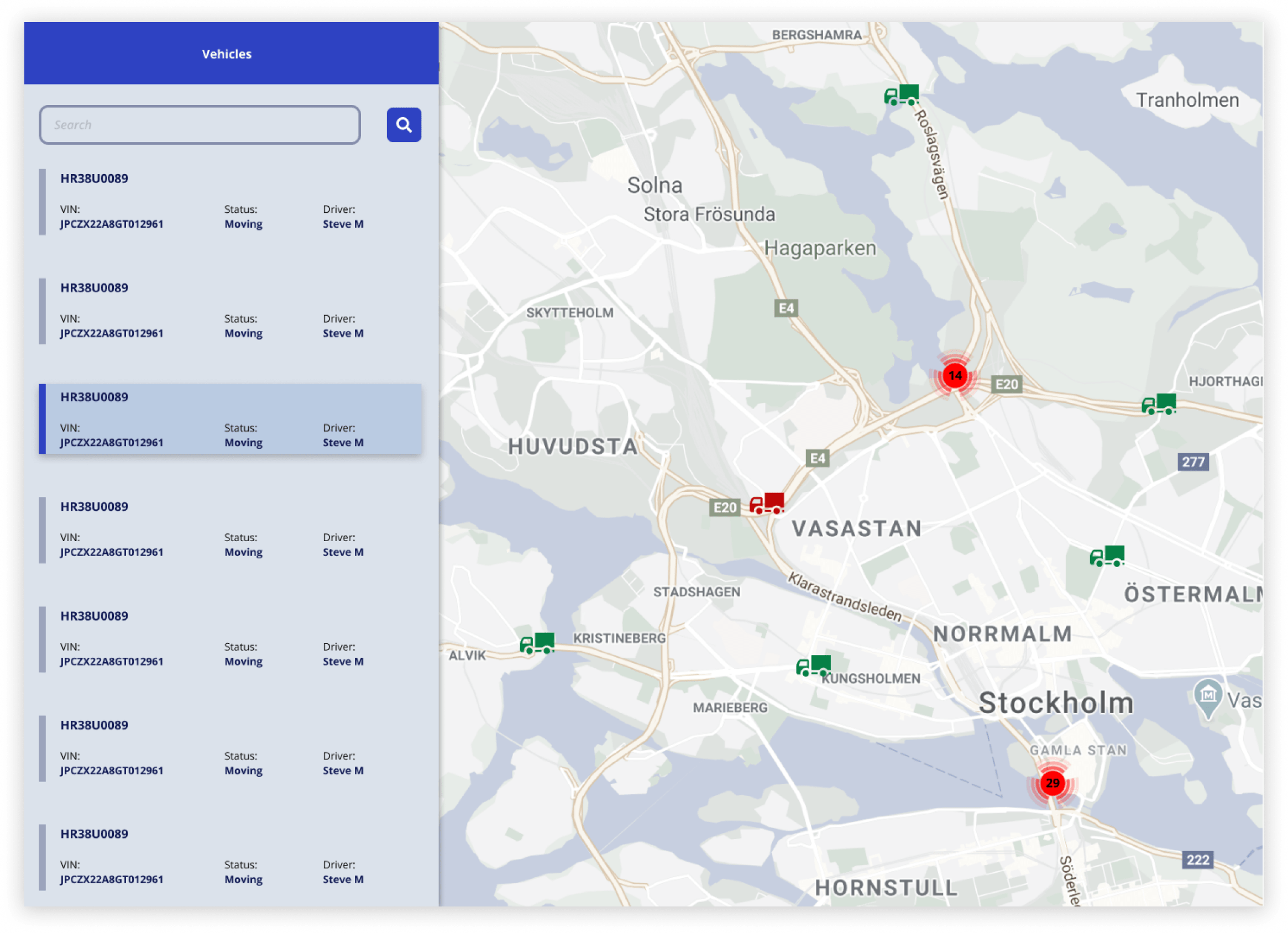
A fleet management platform built without a designer. Operators spent hours navigating a fragmented interface just to piece together basic vehicle data — every task required selecting the same vehicle multiple times across disconnected pages.
Restructured the entire experience around the vehicle, not the feature. One selection surfaces all relevant data in a unified panel alongside the map — no more back and forth.
Task completion rate up 32%. Tracking time reduced by 27%. Architecture validated as scalable for the full product roadmap.
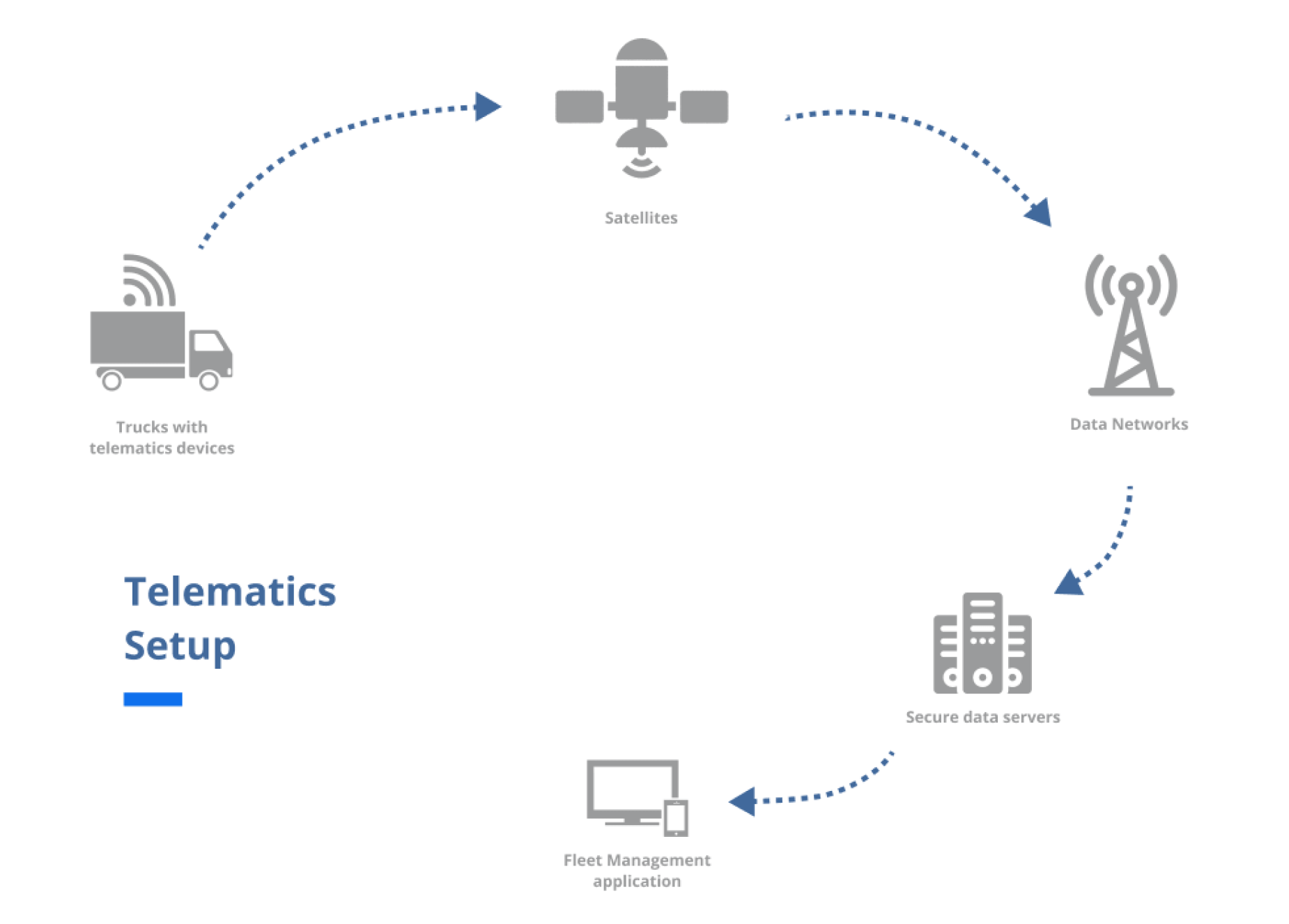
Fleet management platforms are mission-critical tools. Operators rely on them throughout every working hour to monitor vehicle locations, ensure driver safety, track fuel consumption, and maintain compliance across large, distributed fleets.
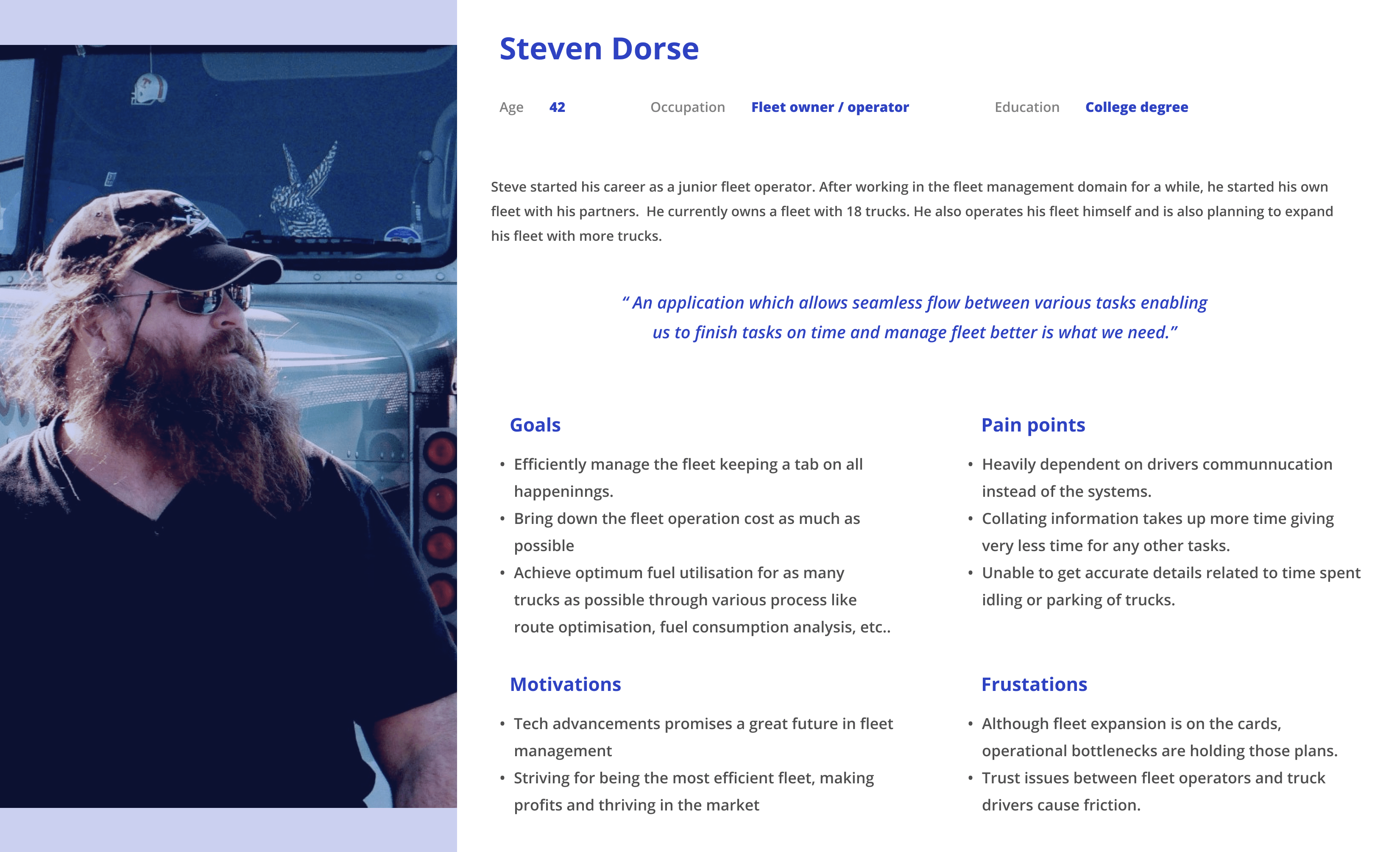
This product served enterprise fleet operators managing anywhere from dozens to hundreds of vehicles across multiple geographies. For these users, the track and trace feature wasn’t a nice-to-have — it was the operational backbone of their day. Missed information or a confusing interface didn’t just cause frustration; it caused delays, miscommunication with drivers, and real financial exposure.
The platform had been built and iterated by engineers without a designer involved. It worked — technically. But it had never been designed for the people using it.
Fleet operators were spending significant time navigating a fragmented interface just to piece together basic vehicle information. Data that belonged together was scattered across separate pages. Every tracking task required selecting the same vehicle multiple times across different sections of the app.
The business risk was clear: competitor platforms were pulling ahead on experience. Clients were vocal. The product team knew the interface was becoming a barrier to retention and expansion — but the scope of the problem hadn’t been formally defined or prioritised.
Beyond usability, the architecture of the feature made it nearly impossible to scale. With a roadmap full of incoming features, the team was building on a foundation that would compound problems rather than resolve them.
I was the sole designer on this project — responsible for the complete end-to-end experience from research through to final visual design and engineering handover.
My cross-functional partners included business analysts, product owners, a project manager, and engineering architects and leads. I worked with this team daily — facilitating alignment, presenting design decisions for stakeholder approval, and navigating competing priorities across product, engineering, and client-facing teams.
I owned every design decision: problem framing, research planning, information architecture, interaction design, visual design, and the design system foundations that came out of this work. Final approvals came from senior leadership, and I was responsible for presenting at each milestone.
Access to end users was indirect. I couldn’t conduct field visits or direct user sessions with fleet operators — all interactions happened through video and audio calls, with insights largely mediated through business analysts who liaised with clients.
The platform had no prior design system or component library. Visual design and interaction patterns had to be built from scratch alongside the redesign itself, without slowing delivery.
Engineering timelines were fixed. Design decisions had to account for feasibility from day one — anything that couldn’t be built within the sprint structure was cut, regardless of its design merit.
Stakeholder alignment spanned multiple levels. Design versions were reviewed and approved at each phase — from the immediate product team up to senior leadership — requiring me to tailor how I communicated decisions depending on the audience.
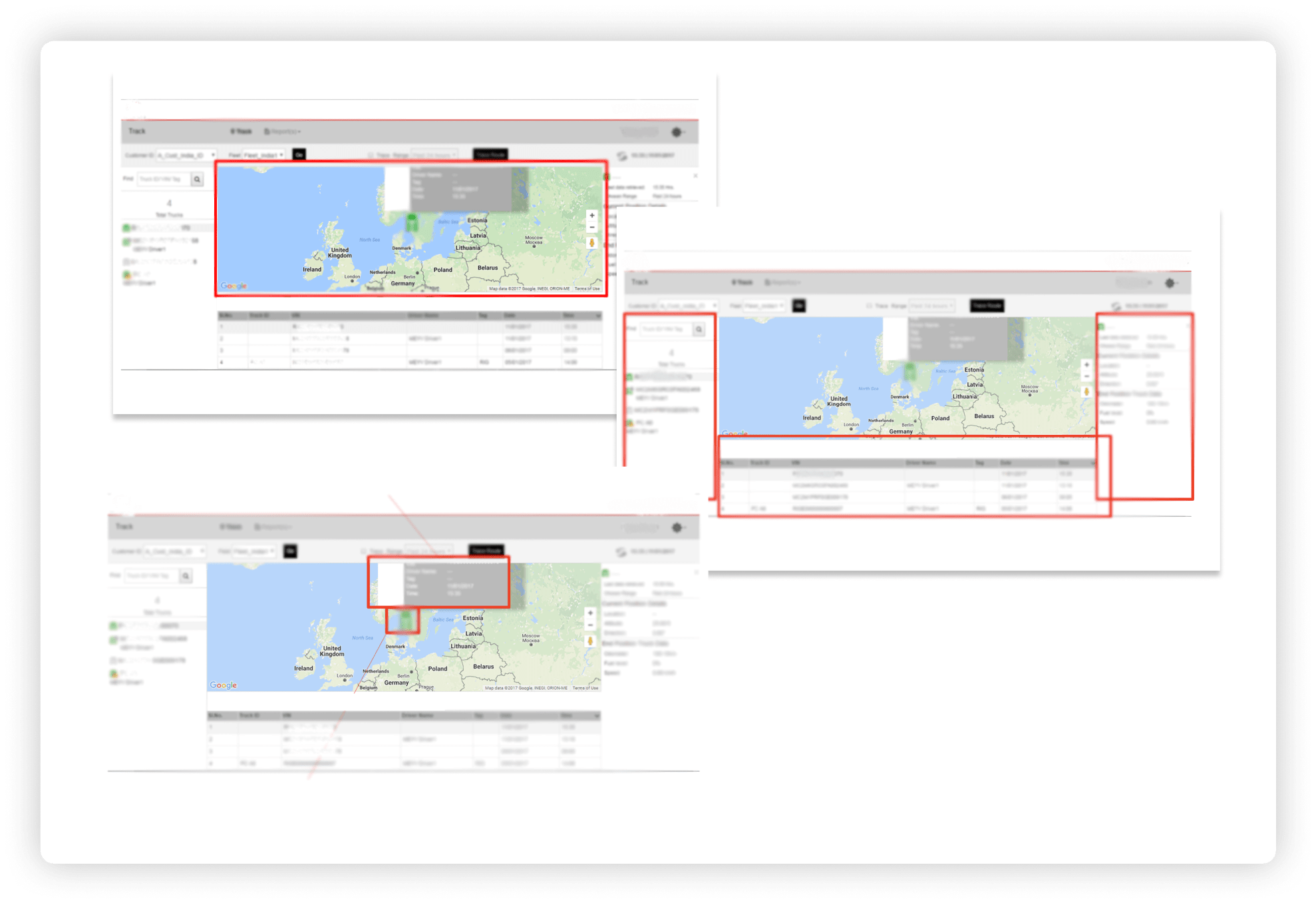
The interface reflected the system architecture, not the user’s mental model. Every feature had its own page. Accessing information about a vehicle meant navigating to that feature first, then selecting the vehicle — over and over. This wasn’t a usability quirk; it was a structural decision that had never been challenged.
Fleet operators didn’t have the setups we imagined. The assumption was that fleet admins operated from well-equipped control rooms with fast internet and large monitors. Reality was the opposite — crowded offices, average hardware, slow connectivity, and constant noise. The interface needed to work in that environment, not a hypothetical one.
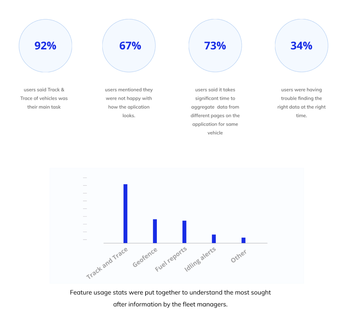
Support tickets and analyst feedback were an untapped research goldmine. Without direct user access, filtering support tickets for experience-related issues surfaced validated pain points — aggregated information gaps, navigation friction, and repeated requests for data export. This shaped the feature priority list more than any other input.
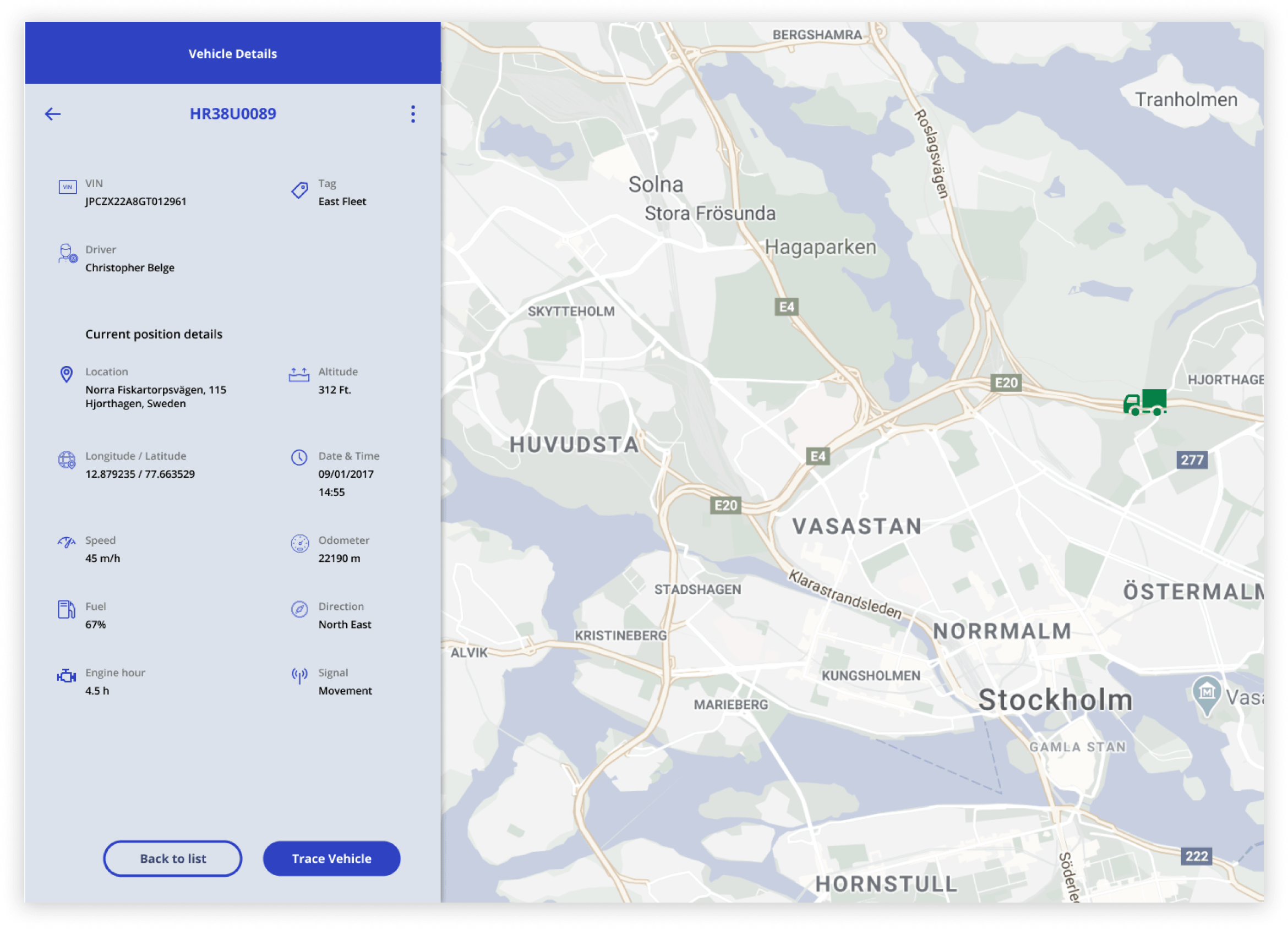
The central strategic decision was to restructure the experience around the vehicle, not the feature. Instead of asking users to navigate to a feature and then select a vehicle, the redesigned model puts the vehicle first — once selected, all relevant data surfaces in a unified view.
This required rethinking the information architecture from the ground up, not patching the existing navigation. It was a bigger ask of engineering, but the alternative — incremental fixes to a broken structure — would have created more problems at scale.
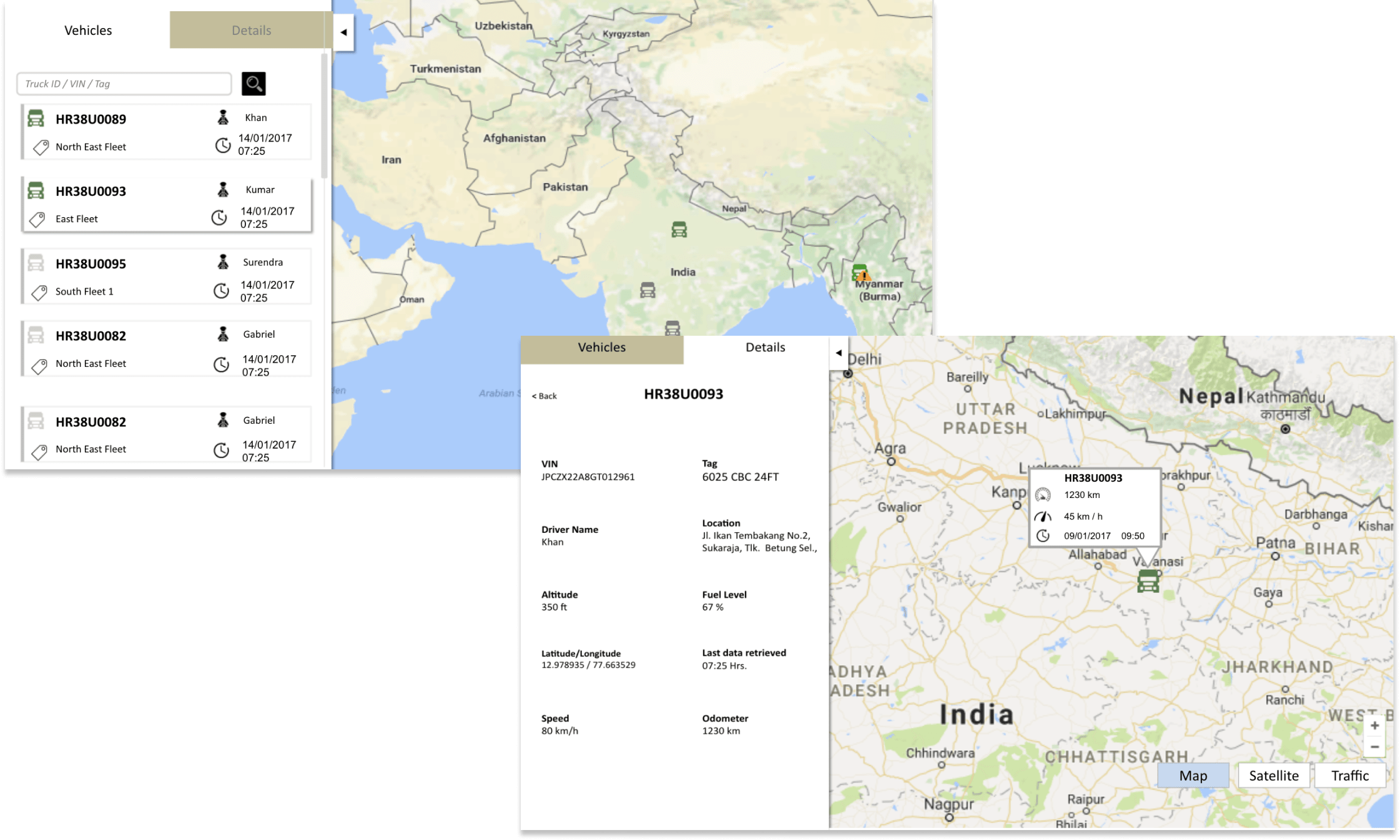
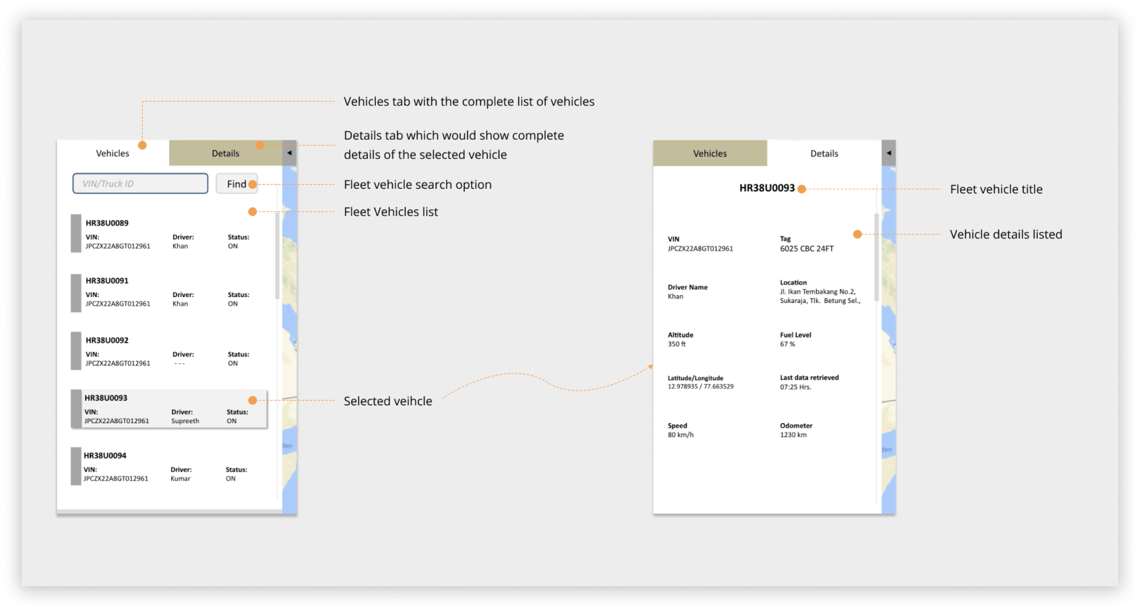
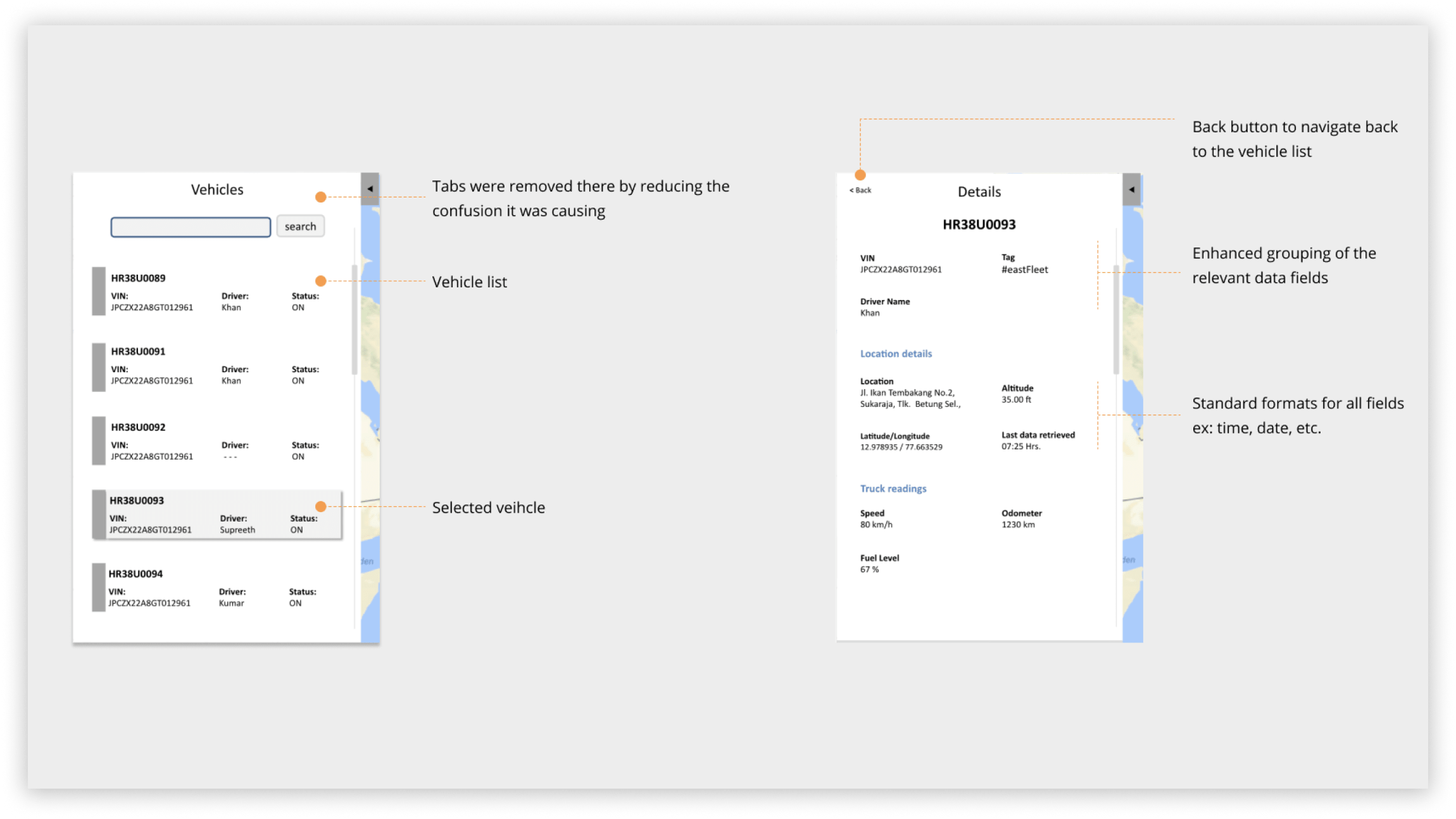
A tabbed panel approach was explored initially, separating the vehicle list and vehicle details into two tabs within a collapsible left panel. Early user testing revealed this created a sense of disconnection — users felt they were losing context when switching tabs. The tabs were removed in favour of a continuous scroll model, keeping vehicle selection and details within a single uninterrupted flow.
The redesigned track and trace feature unified vehicle selection and vehicle details into a single, coherent left panel alongside the map. Selecting a vehicle surfaces all relevant parameters — location, status, operational data — in one place, without requiring further navigation.
The left panel was designed to expand and collapse, preserving as much map area as possible — critical for operators working on smaller or standard-resolution displays.
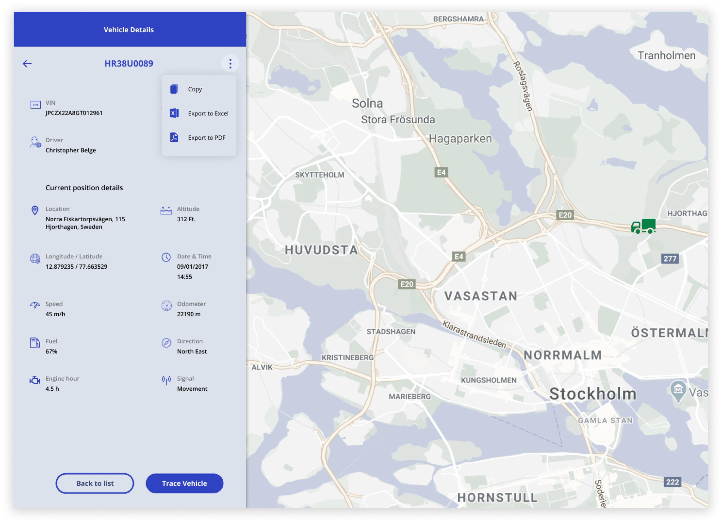
Data export and sharing functionality — the most-requested missing feature — was built into the vehicle details panel directly, removing the need for offline workarounds.
The wireframes were carefully evolved into high-fidelity visual designs. This was my first experience working single-handedly on the entire visual design — demanding but immensely rewarding.
Increase in task completion rate
Reduction in vehicle tracking time
The interface is so much more intuitive now, making it very easy to understand and start using the feature in no time.
— Client fleet operator
Getting the information and using it for other processes is a breeze now. Also, so much less training needed.
— Client end user
The process and reference documents you’ve put together will not only save me from bothering you all the time, but they’ll also make our coffee chats a lot more interesting.
— A developer colleague
Business analysts were my primary channel to users. I worked closely with them to extract structured insight from client feedback and translate it into design decisions they could stand behind in client conversations.
With engineering, the relationship was built on transparency about constraints. I presented design rationale in terms of user outcomes and technical feasibility simultaneously — which reduced revision cycles and built trust with the architecture lead.
Stakeholder presentations were structured around decisions, not process updates. Each review was framed around a clear recommendation with supporting evidence, rather than a walkthrough of design artefacts. This shifted the conversation from feedback-gathering to decision-making, and significantly shortened approval timelines.
The temptation at the start was to improve the existing interface — make it cleaner, fix the visual hierarchy. It was only by stepping back and mapping the full task flow that the structural problem became visible. That step back cost time upfront but prevented a far more expensive course correction later.
If I were doing this again, I would push harder for even one round of in-person field observation with fleet operators. The video calls were valuable, but the environmental realities — noisy offices, slow hardware, the pressure of active fleet management — only became vivid when operators described them in conversation. Seeing it would have accelerated several design decisions.
The design system foundation laid here was one of the most durable outcomes of the project — it outlasted the redesign itself and continued to support the engineering team long after handover.