
Mobile app to track the health & recovery status of Osteoarthritis patients.
Elderly OA patients were dropping off their care plans between hospital visits — missing medication, skipping physiotherapy, losing confidence in their recovery without structured support.
A mobile app designed specifically for senior adults — single task per screen, progress-first over checklist, with direct doctor access and emergency contact built in.
High task completion in testing with minimal instruction. Clinical stakeholders validated the care plan structure. Design system established as foundation for the client’s broader patient engagement roadmap.
A leading medical technology company engaged our team to design a mobile platform to support patients managing Osteoarthritis — a chronic, progressive joint condition affecting over 22% of adults in the US alone, with global prevalence rising sharply with ageing populations.
The platform needed to serve as the central point of care between clinical appointments: delivering personalised care plans, tracking medication and physiotherapy progress, enabling direct access to doctors, and providing condition education — all for a primary user group of senior adults managing multiple concurrent health conditions.
This was not a wellness app. It was a clinical support tool where design decisions had direct implications for patient health outcomes and treatment adherence.
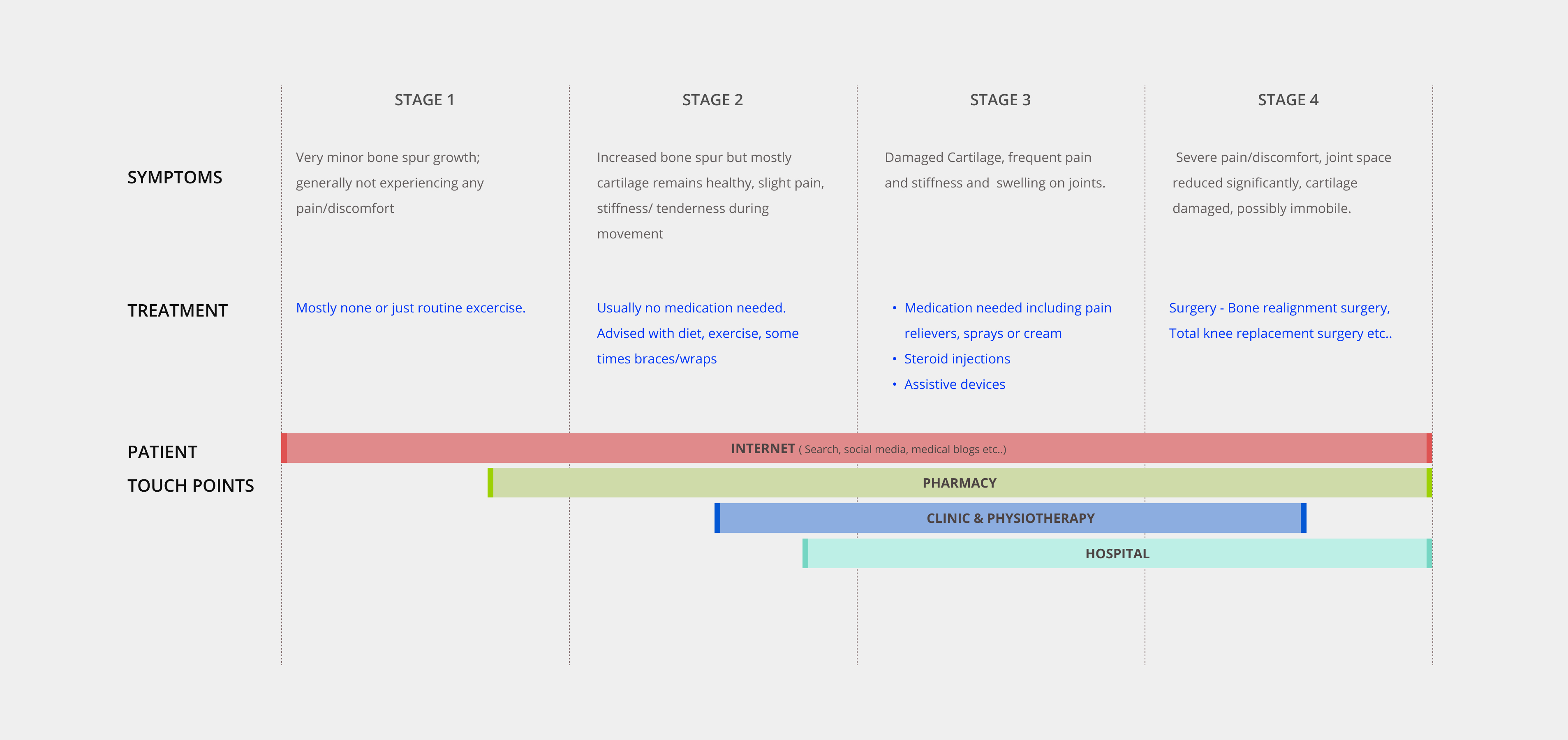
OA patients — particularly senior adults — were struggling to stay consistent with care plans between hospital visits. Physiotherapy compliance dropped significantly without structured follow-up. Medication schedules were missed. Patients felt isolated from their care team and uncertain about whether they were progressing.
The business opportunity was significant: a well-designed patient engagement platform could differentiate the client’s offering in a competitive medtech market, reduce avoidable hospital readmissions, and build a direct digital relationship with patients at scale.
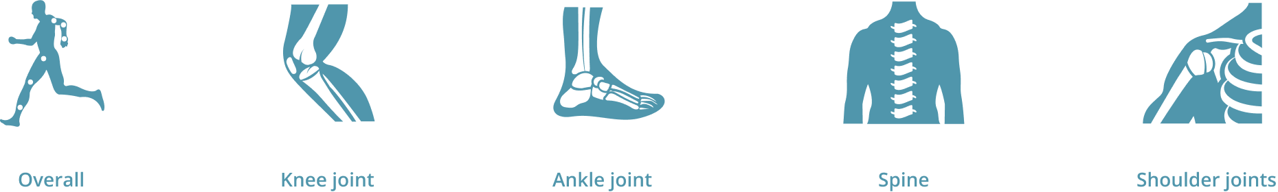
The challenge was designing for a user group with specific physiological and cognitive constraints — reduced fine motor control, declining vision, lower digital familiarity — while keeping the experience clinical enough to be trusted and simple enough to be used independently.
I led the end-to-end experience strategy for the product, from research synthesis through to visual design handover to engineering. The project ran over five months.
I collaborated with a dedicated user research team for the discovery phase, contributing to interview preparation, design principle definition, and use case framing. I then led all design activities independently: navigation architecture, wireframing across fidelity levels, interaction design, prototyping, user testing, and stakeholder presentations. I supported visual designers during the final production phase and managed engineering handover.
Cross-functional partners included the user research team, visual designers, engineering, and the client’s clinical and product stakeholders.
Designing for senior adults introduced non-negotiable accessibility constraints from the outset. Touch target sizes, typography, contrast ratios, and interaction complexity all had to be evaluated against the physiological realities of the primary user group — reduced dexterity, declining vision, and lower tolerance for cognitive load.
The five-month timeline was fixed, requiring disciplined feature prioritisation. During ideation, I identified over 50 possible features. Shipping all of them would have produced an overwhelming, unusable product. The constraint forced a clarity that ultimately improved the design.
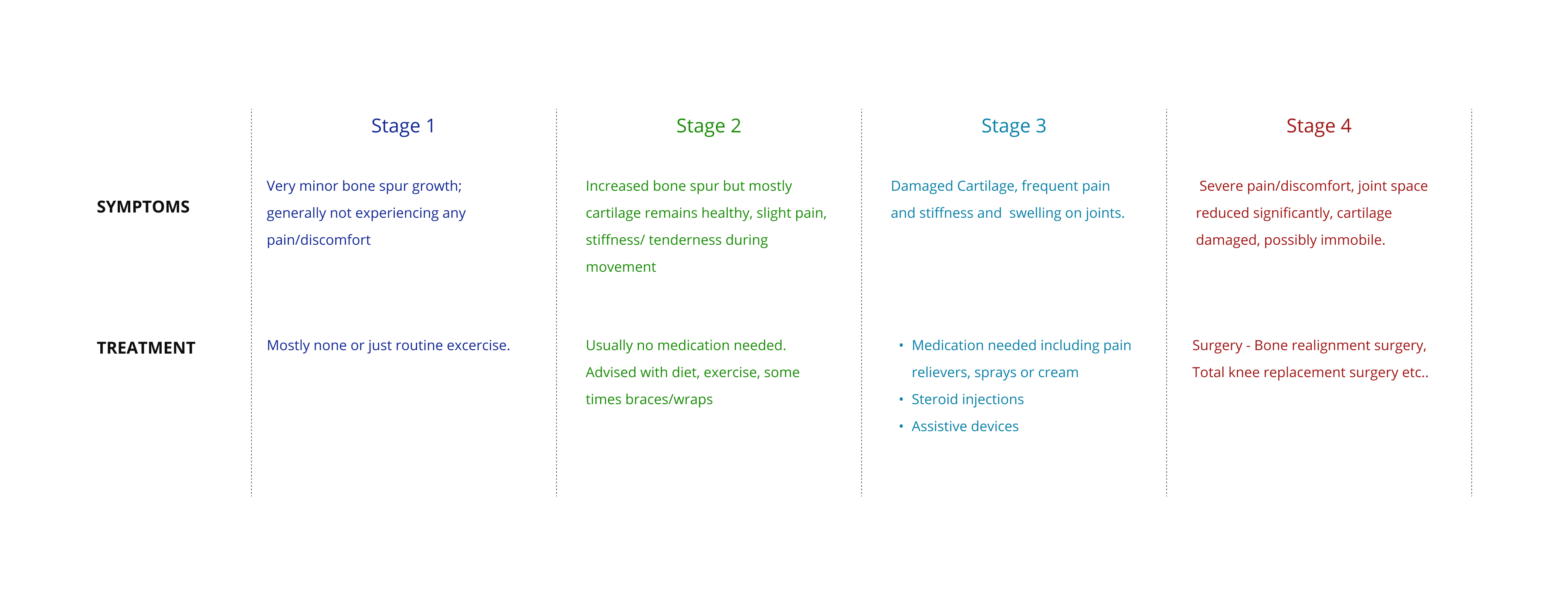
Clinical accuracy was non-negotiable. Content related to OA stages, treatment information, and care plan details required validation against clinical inputs — design decisions could not override medical accuracy.
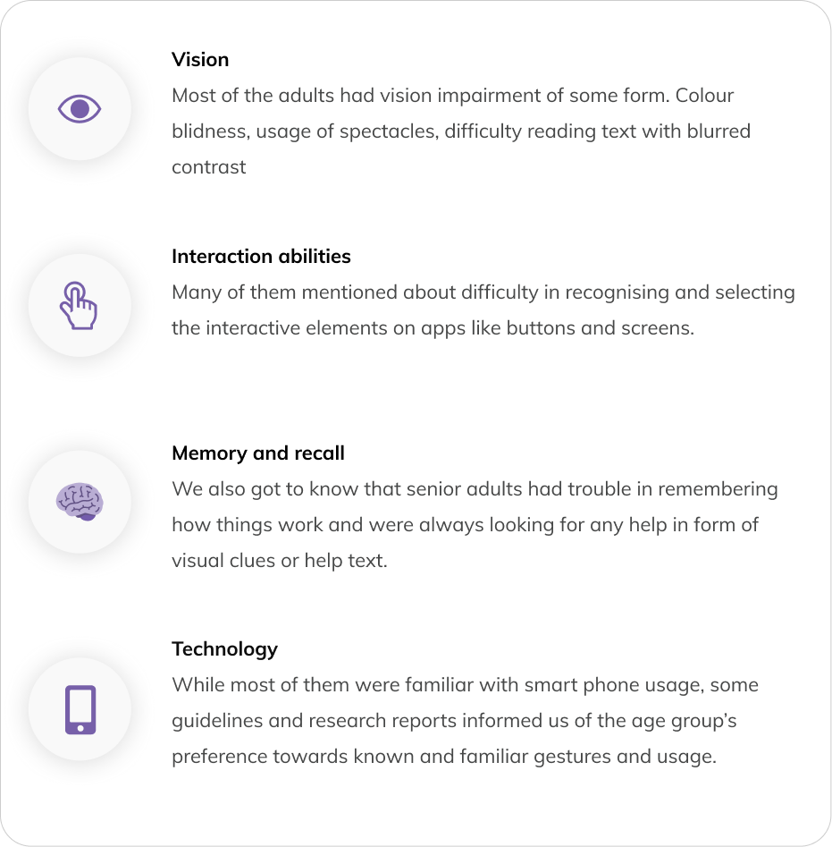
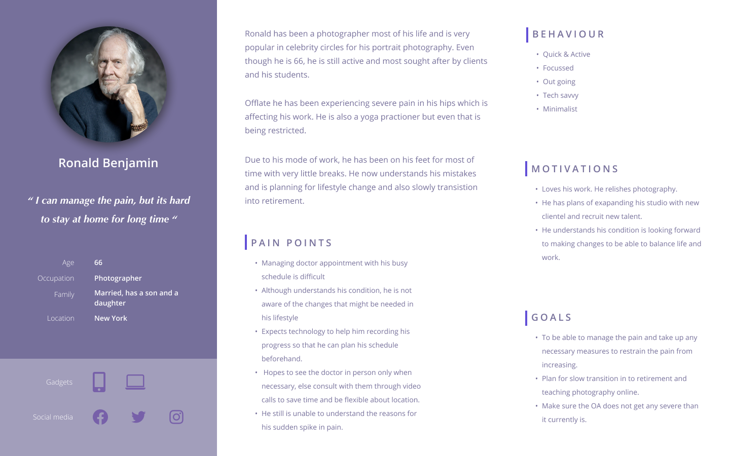
Senior adults were already smartphone users — but on their own terms. Research revealed that the target user group was actively using smartphones for photos, calendar management, messaging, and social media. The barrier wasn’t technology adoption — it was interface complexity. This reframed the design challenge from “teach them to use an app” to “don’t get in their way.”
Patients needed to feel in control, not monitored. Interview insights consistently pointed to confidence and autonomy as the primary emotional need. A care plan tracker that felt like surveillance would fail. One that helped patients see their own progress would succeed. This distinction shaped every interaction model in the product.
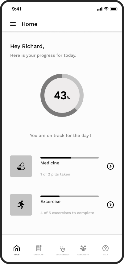
The core strategic decision was to design the app around progress visibility, not task completion. The difference is subtle but significant: a task-completion model tells users what they haven’t done; a progress-visibility model shows users how far they’ve come. For a patient managing a chronic condition, that distinction is the difference between motivation and abandonment.
A single-task-per-screen interaction model was adopted throughout, deliberately limiting the information density per screen to reduce cognitive load. This was a direct response to the research findings on age-related cognitive changes.
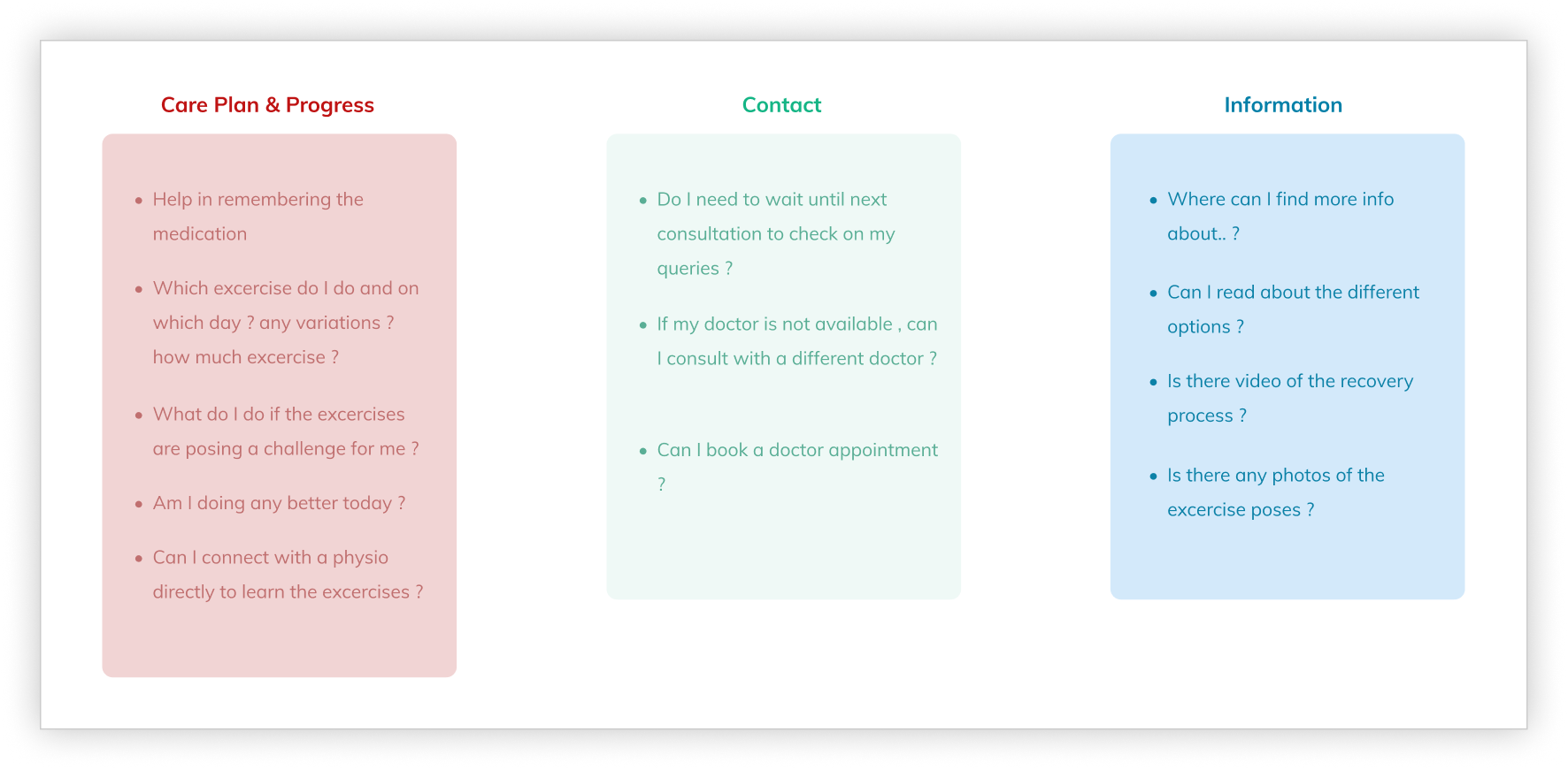
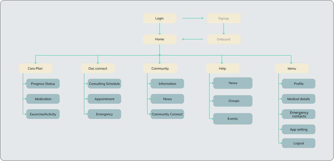
Features were ruthlessly prioritised. Fifty possibilities were reduced to a focused core: care plan tracking, doctor connect, community, help, and profile.
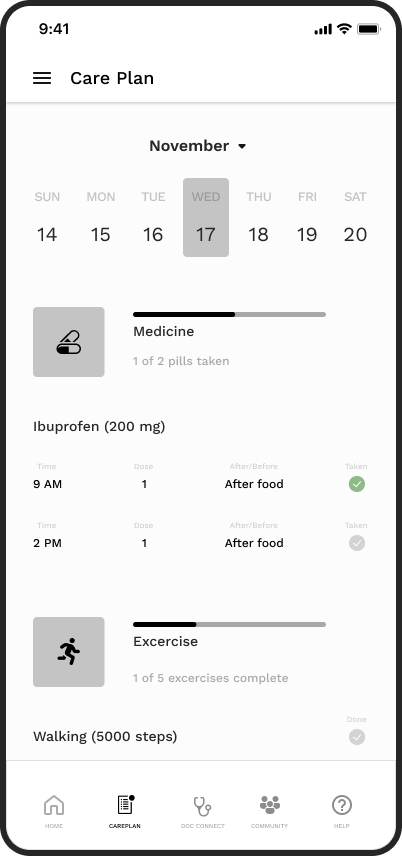
The app centred on a home screen that gave patients an immediate, glanceable view of their daily progress — today’s care plan completion, upcoming activities, and a clear indication of overall trajectory.
From the home screen, patients could navigate directly to their full care plan — medication schedules and physiotherapy tasks displayed in a structured, completable format. Marking tasks complete was designed as a deliberate, satisfying interaction to reinforce positive behaviour.
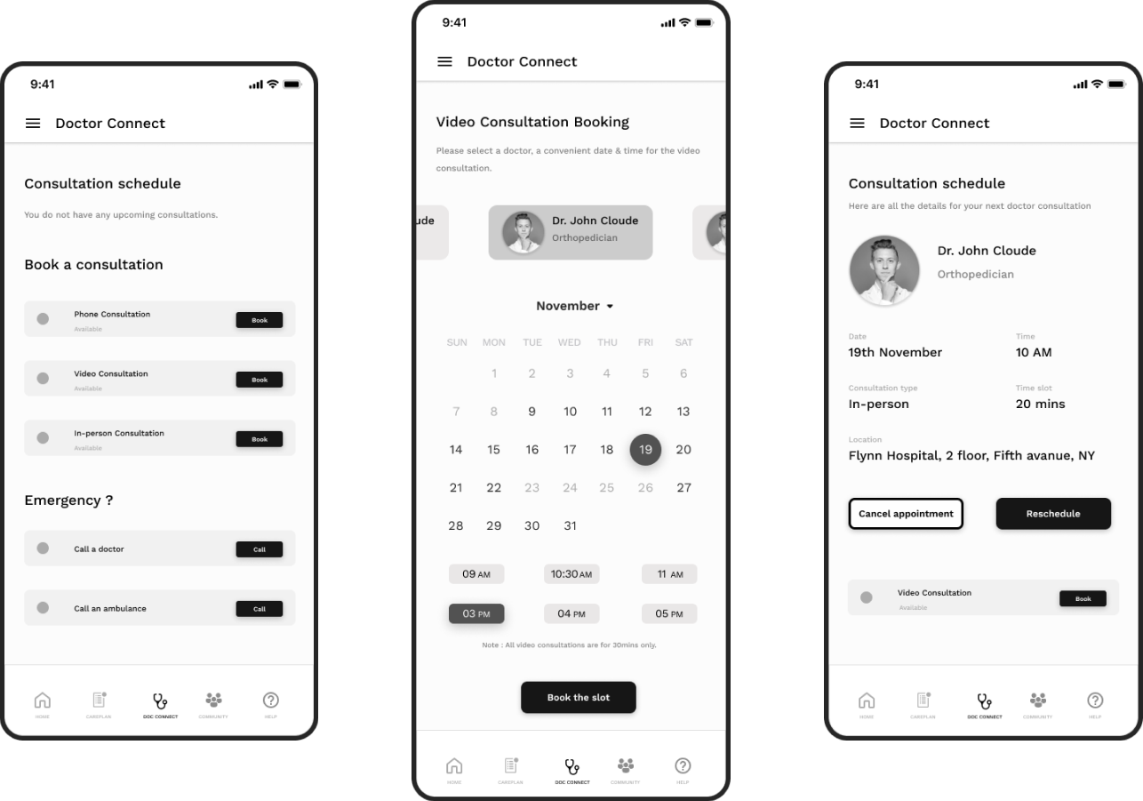
Doctor Connect enabled patients to view upcoming consultations, book new appointments, and access emergency contact options without navigating through multiple layers — critical for an anxious or unwell user.
Formal post-launch metrics were not available within the scope of this engagement. However, validated outcomes from user testing included:
The research team and I operated as a tight unit during discovery, ensuring that design decisions were grounded in validated user insight rather than clinical assumption. I pushed early and consistently for the user interview findings to be translated into design principles before any wireframing began — this created a shared reference point that prevented scope creep and resolved design disagreements with evidence rather than opinion.
With the client’s clinical stakeholders, I framed design decisions in terms of patient outcome alignment rather than UX convention. This shifted the conversation from “does this look right” to “does this serve the patient” — a more productive and faster path to approval.
The five design principles established early — simplicity, single task focus, familiar mental models, accessible help, and clean delight — served as a decision filter throughout the entire project. They made trade-off conversations faster and kept the team aligned without requiring constant re-explanation of the design rationale.
The absence of post-launch metrics remains the most significant gap in this case study. For future projects of this nature, I would negotiate upfront for access to at least a limited set of post-launch engagement metrics, even in a contracted engagement. The design decisions here were sound — but the story is stronger with evidence of real-world impact.
Going from 50+ features to a focused core wasn’t comfortable — but it was the right call. The design principles and user tests gave us the confidence to cut without second-guessing. That discipline is what made the final product feel coherent rather than cluttered.