Industrial plants running on paper. A global workforce with no digital support. And a product that had to work in a metal tank with no internet signal.
Critical industrial inspections were running on paper clipboards. Missed readings, lost records, and zero real-time visibility for supervisors — until the shift ended and the damage was already done.
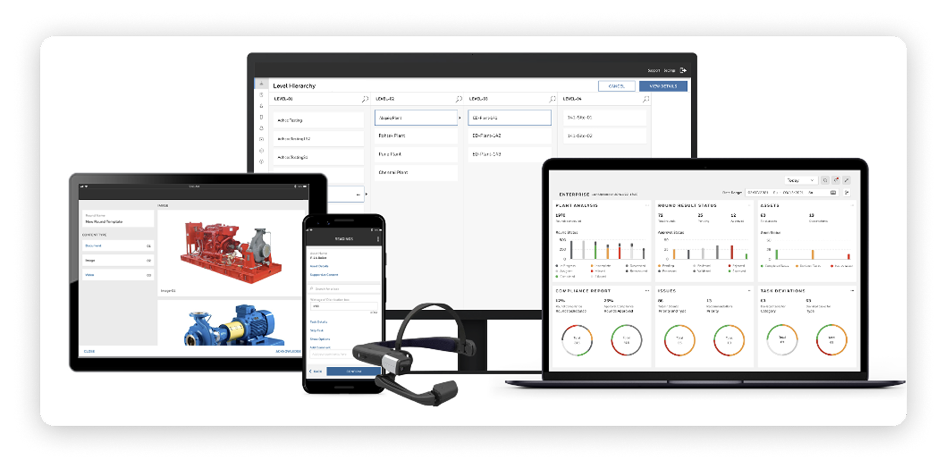
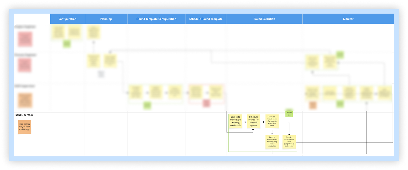
A four-layer digital platform — configuration, scheduling, field app, and analytics — each designed for a completely different user and mindset, working together as one seamless product.
60% time saved on field operations. 15% reduction in reactive maintenance. Zero paper forms. Every inspection record now digital, searchable, and auditable from day one.
This enterprise industrial software product is used by plant operators, field workers, and supervisors across oil and gas facilities, chemical plants, and manufacturing sites worldwide.
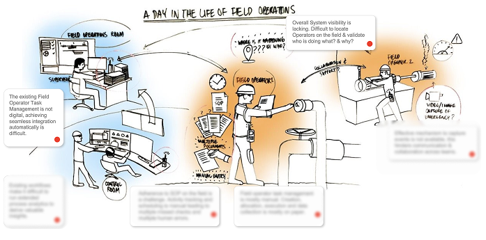
Every day in these plants, workers walk pre-defined routes — checking equipment, recording readings, verifying that critical assets are functioning within safe parameters. For decades, this was done with a clipboard. A paper form. A pen. And at the end of a shift, a stack of sheets that someone had to manually enter into a system — if they entered them at all.
The product needed to replace the clipboard entirely. Not just digitise it — replace the entire workflow, from how assets are configured to how supervisors schedule rounds, how field workers execute them, and how decision-makers interpret the data afterwards.
The paper-based inspection process had four fundamental failures that no amount of process improvement could fix.
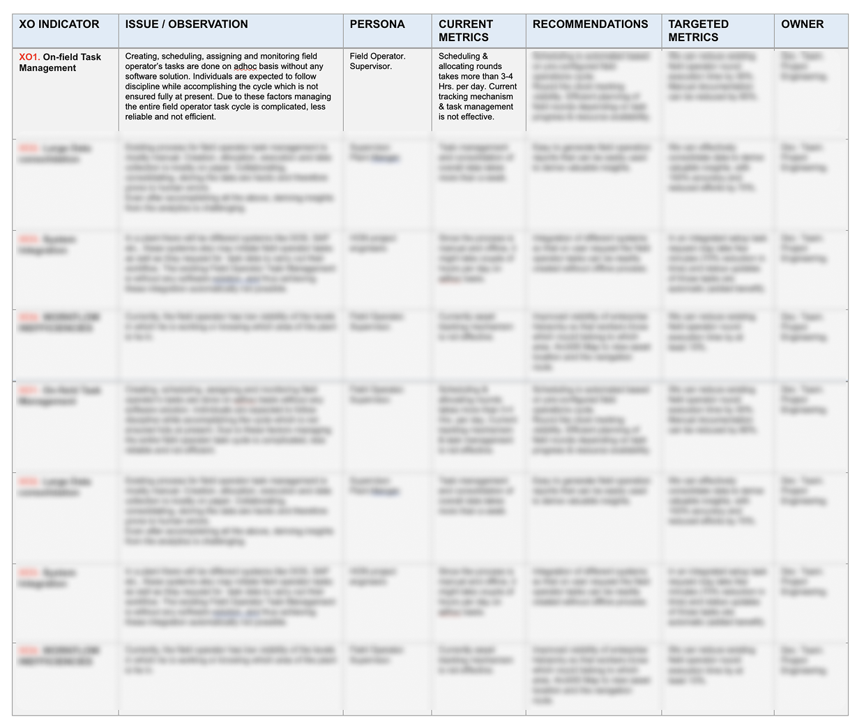
First, there was no real-time visibility. A supervisor had no idea whether inspections were happening until a worker physically returned and handed them a form. A critical reading taken at 9am wouldn’t reach a supervisor until noon — or not at all if the form was misplaced.
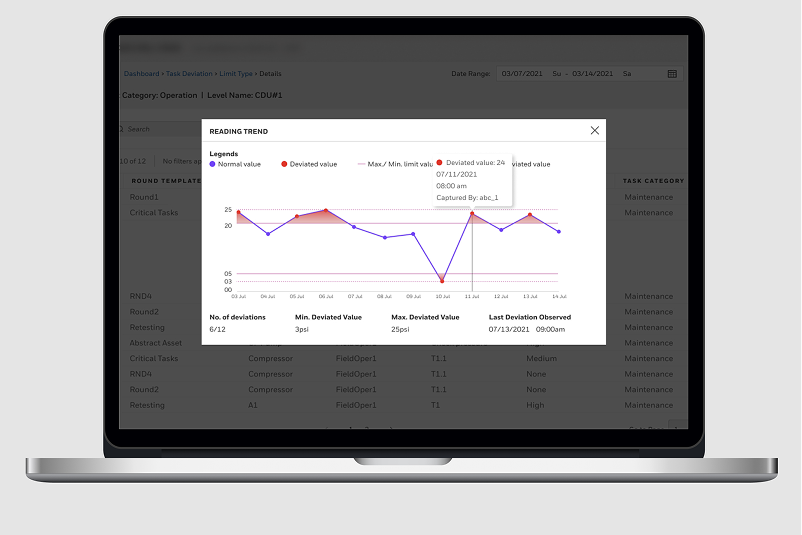
Second, data quality was unpredictable. Handwritten readings could be misread, illegible, or simply missing. There was no system to flag that a reading was outside safe limits. A worker could write down a dangerous value and no alert would fire.
Third, audit trails were incomplete and unreliable. Regulators require documented evidence that inspections were conducted. Paper records could be lost, damaged, or simply never filed. Compliance audits were a source of genuine anxiety.
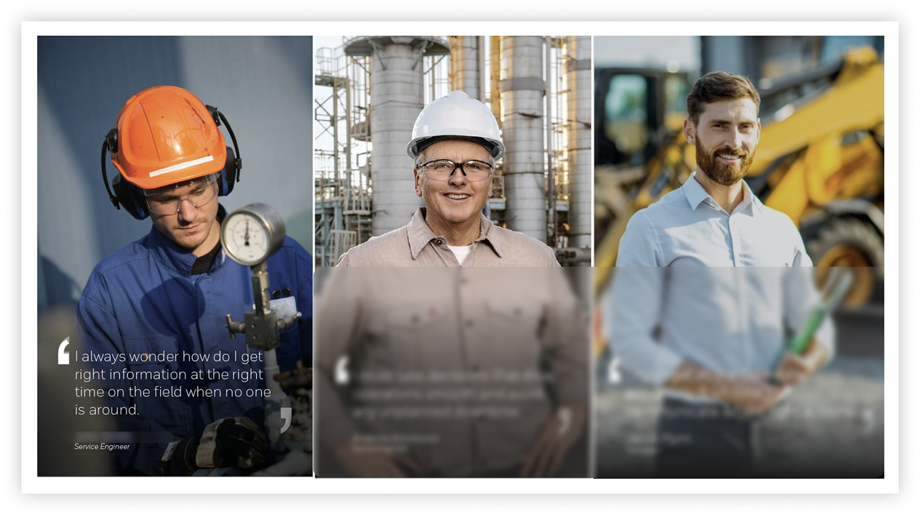
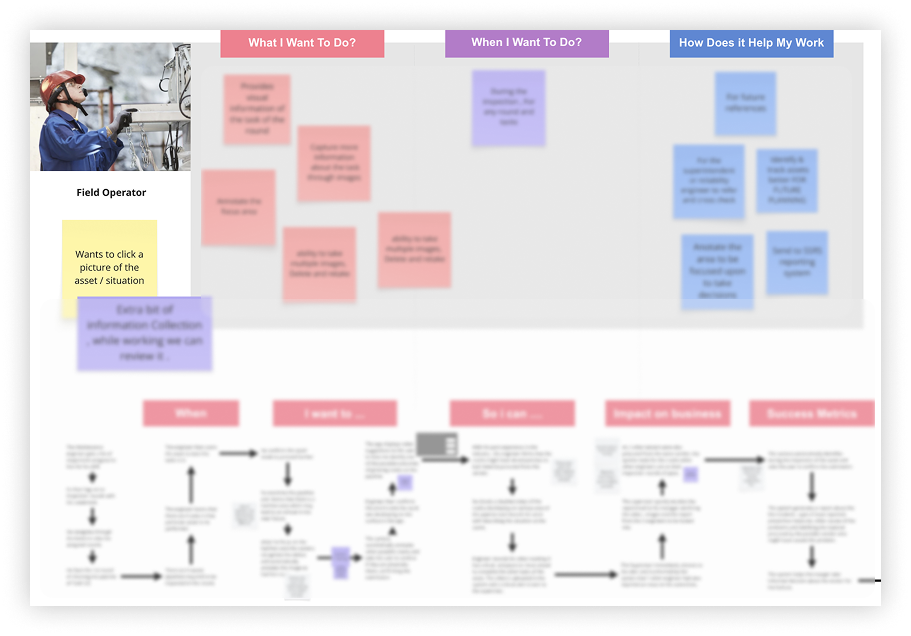
Fourth, the workforce had never been asked what they needed. The tools they used had been designed by engineers for processes, not for people. No one had ever sat with a field worker and asked: what makes this hard?
As Senior UX Supervisor at a global industrial technology company, I led the UX strategy and design direction for a Connected Industrial inspection platform as part of a broader SaaS portfolio. I worked with a team of designers, partnering daily with product managers, engineering architects, and domain experts across the organisation.
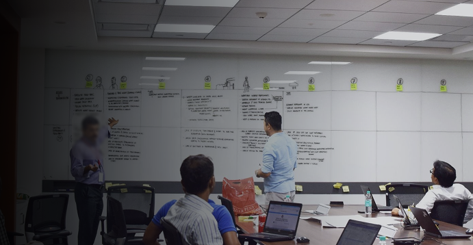
My responsibilities spanned the full product: owning the experience strategy across all four layers of the platform, facilitating design thinking workshops with stakeholders, establishing usability validation practices with internal subject matter experts, and driving alignment between engineering, product, and commercial leadership on design decisions.
I also shaped how the team approached the unique challenges of industrial UX — building frameworks for designing in constrained environments, for variable digital literacy, and for safety-critical interactions where a design error isn’t just a bad experience, it’s a risk.
Industrial UX operates under constraints that most digital design has never encountered.
Connectivity was unreliable by design. Inside metal tanks, deep pipelines, and remote plant sections, there is no internet. The app had to work fully offline, sync automatically when signal returned, and handle data conflicts gracefully — all without the worker needing to manage any of it manually.
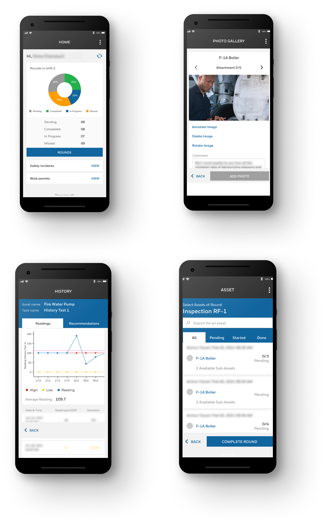
The physical environment was hostile. Workers wore thick protective gloves. Screens had to be readable in direct sunlight. Every interaction had to be completable with one hand. Touch targets that are adequate for a desk are unusable in the field.
Data entry carried real consequences. A mistyped pressure reading next to a loud, vibrating machine isn’t just an inconvenience — it’s a potential safety incident. Every data entry point needed instant validation feedback and clear out-of-limit warnings before a record was committed.
The user base spanned the entire digital literacy spectrum. Some users were tech-native; others were holding a smartphone as a work tool for the first time. The same product had to serve both without either feeling compromised.
Scale was genuinely extreme. The platform needed to manage thousands of assets, hundreds of workers, and millions of inspection records — while still feeling simple enough for a single worker on a single route.
The clipboard wasn’t just a tool — it was a coping mechanism. Workers had developed elaborate personal systems around their clipboards: colour-coded annotations, folded corners, personal shorthand. These weren’t inefficiencies to remove; they were signals about what information mattered most to them. The digital product had to honour this logic, not override it.
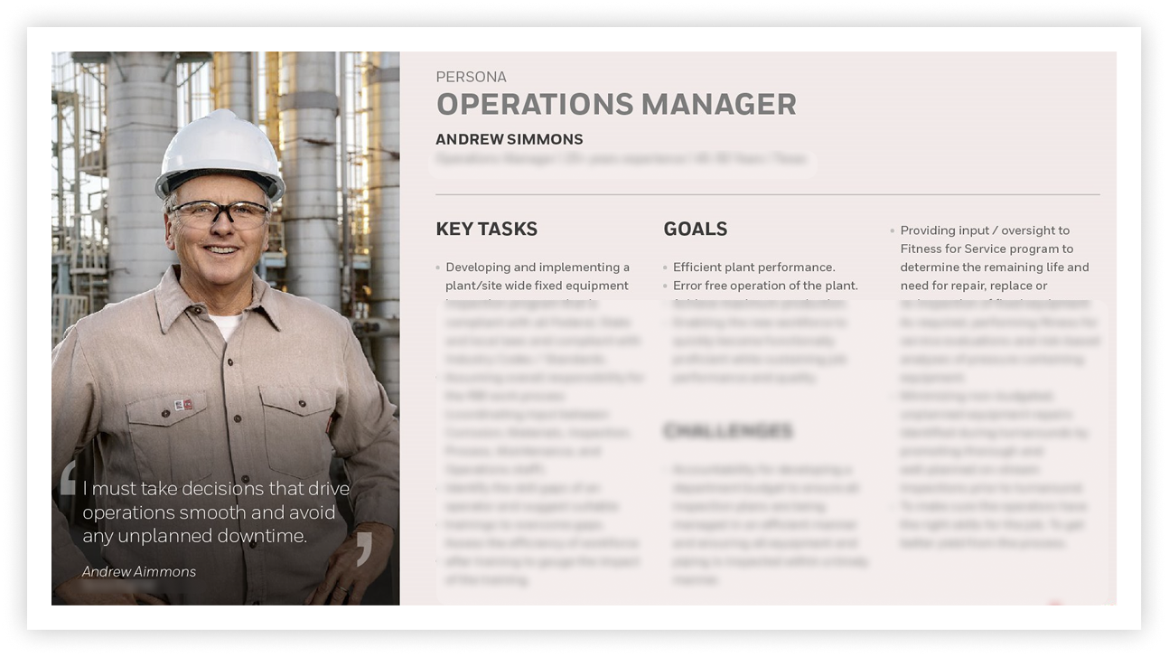
Supervisors didn’t need more data — they needed less, faster. The assumption going in was that supervisors wanted comprehensive dashboards. What they actually needed was an immediate answer to one question: is everything okay right now? Anything that didn’t serve that question was noise.
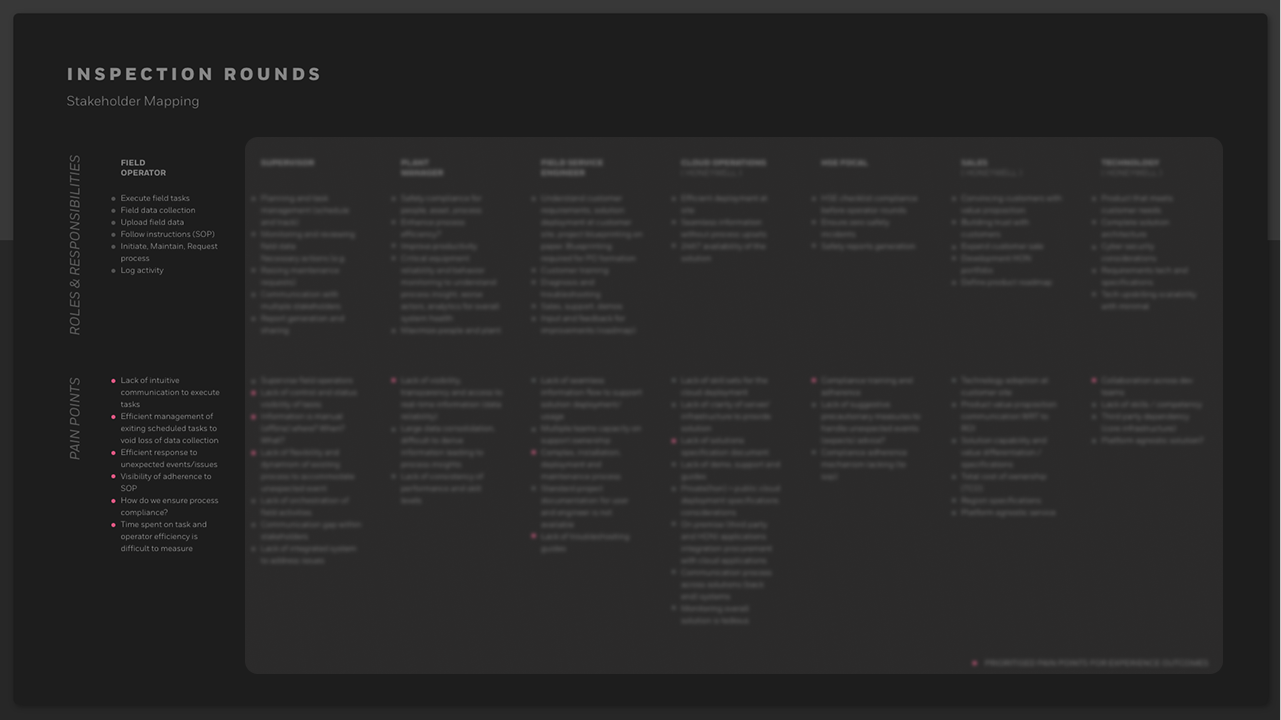
Approval chains were broken before the product even existed. Workers had stopped raising issues on paper because nothing happened when they did. Rebuilding trust in the reporting system was as much a design challenge as building the reporting system itself. Transparency into where a submission sat in the approval chain had to be a first-class feature, not an afterthought.
Configuration was the hidden UX problem nobody had solved. Every existing tool required IT consultants to set up. The cost and time of getting a plant’s asset library into the system was a major barrier to adoption. Making configuration self-service — with a UI that a plant manager could use without external support — was one of the most impactful design decisions of the whole project.
The central strategic decision was to acknowledge what the data made obvious: this wasn’t one product for one user. It was four completely different experiences that had to work together as one.
Attempting to design a single unified interface that served an IT admin configuring 10,000 assets and a field worker checking the next item on a route would have failed both. The strategic answer was to design four clearly separated layers — each with its own information architecture, interaction model, and visual density — while ensuring that the data flowing between them was seamless and invisible to the user.
This also shaped how the team worked. Rather than designing the product linearly, we ran parallel design tracks for each layer, with regular integration checkpoints to ensure the four experiences remained consistent in the moments they touched each other — handoffs between scheduling and the field app, escalations from the field to the approval chain, data flowing from the field into analytics.
The platform was structured across four layers, each designed for a fundamentally different user and context.
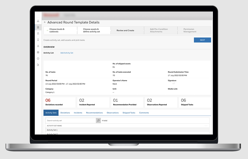
Layer One — Configuration. Built for IT admins and plant managers. A graphical asset tree lets admins navigate thousands of assets without drowning in them. Bulk import handles the heavy lifting. Validation highlights only the rows that need fixing. Templates let them define an asset class once and apply it everywhere. The complexity is contained, not hidden.
Layer Two — Scheduling. Built for supervisors. A calendar view showing who is working, what rounds are assigned, and what’s overdue — at a glance. Ad-hoc rounds push to a specific worker’s device in seconds. Advanced features like conditional rounds and geo-locked tasks are one layer deeper, available without cluttering the everyday view.
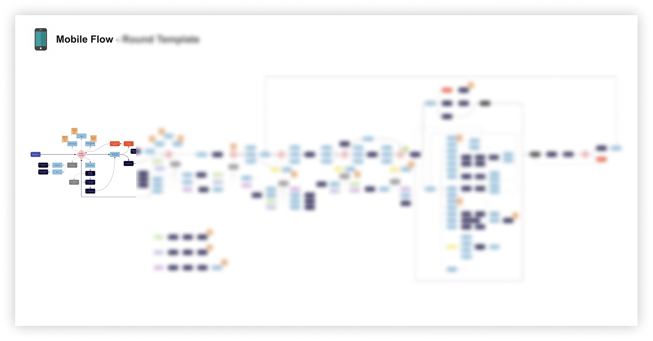
Layer Three — The Field App. Built for the worker in the hard hat. One screen, one task, one thing to do next. Large tap targets work with gloves. Out-of-limit readings turn red immediately. QR scanning means no manual asset ID entry. GPS validates location without the worker having to think about it. Offline mode works without any action required.
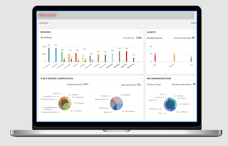
Layer Four — Analytics. Built for decision-makers. Deviations surfaced proactively. Compliance reports auto-generated. Every action in the system leaves a digital trace. Dashboards readable in under 30 seconds by someone walking past a screen.
Reduction in time spent on field operations through workflow digitalisation
Reduction in reactive maintenance — problems caught before they broke
Paper forms — every inspection record now digital, searchable, and auditable
Inspection evidence captured automatically for regulatory compliance
Supervisory visibility — field data seen as it happens, not hours later
New workers learn the app without formal software training
The numbers only tell part of the story. A worker who used to carry a clipboard now carries a device that tells them exactly where to go, what to check, and flags a problem before they even have to think about it. A supervisor who used to wait for the end of a shift to review paper forms now sees a live view of their entire plant. A compliance officer who used to dread audits now generates a report in seconds.
Stakeholder alignment on a product of this complexity required more than good design work. It required a consistent language for talking about design decisions in terms that each stakeholder group found meaningful — safety outcomes for the compliance team, workflow efficiency for plant managers, engineering feasibility for architects, and adoption metrics for commercial leadership.
I established structured usability validation practices with internal subject matter experts — domain specialists who understood the industrial context in ways that external user research couldn’t fully replicate. This gave design decisions a credibility with engineering and product leadership that purely aesthetic or UX-principle-based arguments wouldn’t have had.
One of the most significant alignment challenges was the configuration layer. Engineering saw it as an infrastructure problem; product saw it as a setup cost to minimise; the design team saw it as a first-impression moment that would determine whether the product got adopted at all. Getting those three perspectives into agreement required a shared prototype, a structured evaluation session, and a clear articulation of the cost of getting it wrong.
In consumer UX, the environment is assumed to be comfortable, well-lit, and connected. In industrial UX, the environment is adversarial. Designing for gloves, sunlight, and one free hand isn’t an edge case — it’s the core brief. Every assumption you carry in from consumer product design has to be interrogated before it applies here.
Simplicity in consumer UX often means fewer options. Simplicity in enterprise industrial UX means the right options, at the right moment, for the right user — with everything else hidden but available. The skill isn’t removing complexity; it’s containing it. Those two things look completely different in practice.
The worker doesn’t think about the app. They think about the job. That’s the goal. The hardest design problems aren’t on glamorous consumer apps — they’re the ones where the stakes are real, the environments are brutal, and the users have never been asked what they need before. This project was a reminder of why that work matters.